Willowbrook Family Dental

- Project
- Sample website
- Audience
- Family dentistry · Nashville, TN
- Scope
- 5 pages · design and build
The brief
Who it’s for. What it needs to do.
Help a new patient picture the first visit.
Willowbrook makes the care understandable and the office feel approachable. Nashville families can look through the care options and see what the practice is like before they ask for an appointment.
This is a fictional business, and everything it says about itself was written for this sample.
Design decisions
A closer look at the choices behind the pages.
Keep care options readable
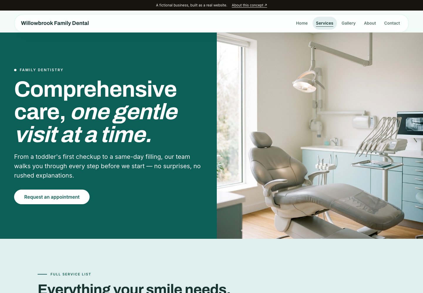
A split homepage and a clear grid of services keep things bright and organized, and rounded buttons soften the look. The navigation uses the labels people expect, so care, background and contact are easy to tell apart.
Build familiarity through photographs
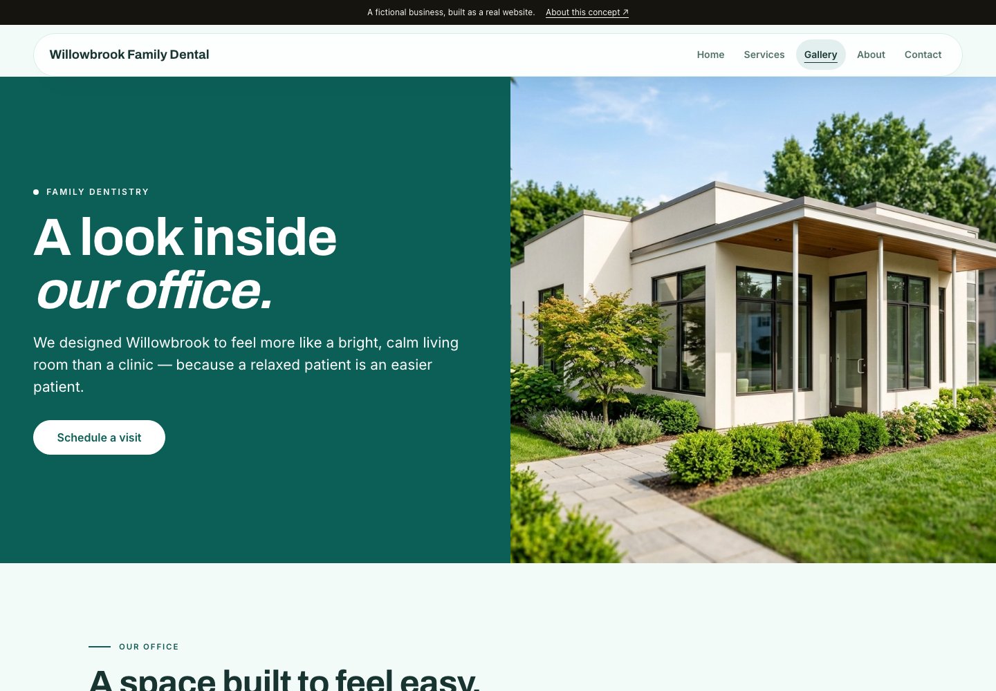
A mosaic gallery shows the office, which can help a nervous patient know what to expect. The header stays the same everywhere, so it’s easy to get back to the services afterward.
The visitor’s path
From the first question to the next step.
Meet the practice ↗
Booking an appointment is the first button on the homepage, with services right beside it.
Read about the care ↗
Six services, including children’s dentistry, sedation and emergency care, sit in one grid.
Become familiar with the practice ↗
Read why Dr. Whitfield started Willowbrook, then look around the office.
Book a visit ↗
Patients can request an appointment through the form or call the office instead.
Delivered work
What’s here, and what it demonstrates.
An easy office to get to know
Care, the office, Dr. Whitfield’s story and booking are spread across five pages.
A look first
Services and the office both come before any request for an appointment.
Explore the website
Take a closer look at the finished pages.
The form is part of the sample and doesn’t send.
Let’s make it yours.
Tell us about your business and the people you serve. We’ll plan the pages around what your website needs to do.