Harborview Animal Rescue
Harborview Animal Rescue is a fictional animal rescue & adoption business in Tacoma, WA, built as a complete, working website concept by MantelMarketing. Click through every page below, switch between desktop and mobile, and see what a finished site feels like before you start yours.
- Palette
- Light ground, one decisive accent
- Type
- a sturdy workaday grotesque — civic, friendly, unfussy
- Pages
- 5 — Home, Adopt, Gallery, About, Contact
harborviewrescue.example/
Inside this build
Every page here is designed, written, and arranged the way a real animal rescue & adoption site should be. No placeholders, no lorem ipsum. Here’s what each one carries:
- Home
- a full-screen opening · the offering, laid out plainly · a photo series · the numbers that build trust · customers in their own words · a closing ask
- Adopt
- a full-screen opening · one customer quote, full width · the offering, laid out plainly · hours, service area, and credentials · a closing ask
- Gallery
- a full-screen opening · a photo series · a closing ask
- About
- a full-screen opening · customers in their own words · hours, service area, and credentials · a closing ask
- Contact
- a full-screen opening · a working contact layout · straight answers to common questions
Why it looks this way
- Layout
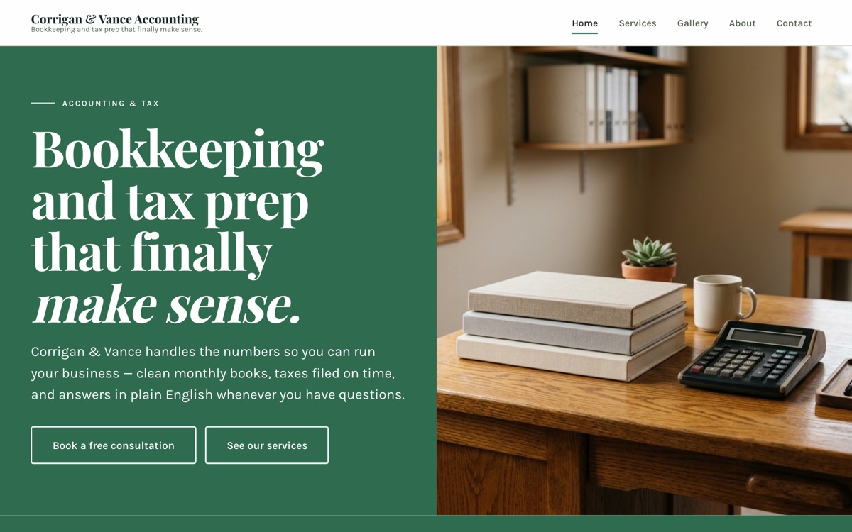
- The homepage opens on a split panel: a solid field of the brand's accent color beside full-height photography, so the brand's color does the talking before a single word is read.
- Type & color
- The typography is a sturdy workaday grotesque — civic, friendly, unfussy, on a light ground with a single decisive accent. No gradient on every section, no five colors competing for attention. Small businesses win trust with clarity, and every choice on this build works toward that.
- Not a template
- The same brief in a different industry, or the same industry with a different personality, comes out looking like a different studio built it. Compare Harborview Animal Rescue with the other nonprofit build below to see exactly that.
What a nonprofit site has to get right
Donate buttons that feel like checkout
Donating to a cause shouldn’t feel like buying a hoodie. When the giving flow reads like a store checkout, a moved donor closes the tab before they finish.
Impact reports buried as PDFs
Your annual report is your best argument for the next gift, and a buried PDF is where that argument goes to die. It deserves a real page a donor will actually read.
Curious how your current site handles these? Run the free nonprofit site audit. It checks the exact things above, in about a minute.
Keep exploring the collection
All eighteen builds →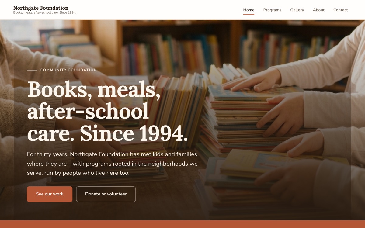
Yours would be board nineteen.
Same process, your real business: designed, written, and live for one flat monthly price. No project fees.
Not sure which direction fits you? Try the style playground.