Harlowe & Finch
Harlowe & Finch is a fictional urban condos & new construction business in Austin, TX, built as a complete, working website concept by MantelMarketing. Click through every page below, switch between desktop and mobile, and see what a finished site feels like before you start yours.
- Palette
- Light ground, one decisive accent
- Type
- a contemporary grotesk with a technical edge
- Pages
- 5 — Home, Listings, Gallery, About, Contact
harlowefinch.example/
Inside this build
Every page here is designed, written, and arranged the way a real urban condos & new construction site should be. No placeholders, no lorem ipsum. Here’s what each one carries:
- Home
- a full-screen opening · the numbers that build trust · the offering, laid out plainly · a photo series · customers in their own words · a closing ask
- Listings
- a full-screen opening · story rows that alternate image and text · the offering, laid out plainly · hours, service area, and credentials · a closing ask
- Gallery
- a full-screen opening · a photo series · a closing ask
- About
- a full-screen opening · customers in their own words · hours, service area, and credentials · a closing ask
- Contact
- a full-screen opening · a working contact layout · straight answers to common questions
Why it looks this way
- Layout
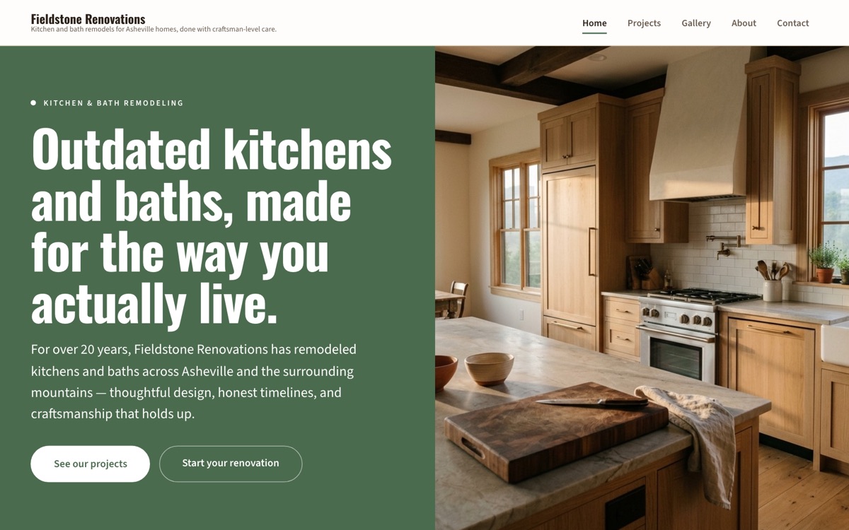
- The homepage opens on a split panel: a solid field of the brand's accent color beside full-height photography, so the brand's color does the talking before a single word is read.
- Type & color
- The typography is a contemporary grotesk with a technical edge, on a light ground with a single decisive accent. No gradient on every section, no five colors competing for attention. Small businesses win trust with clarity, and every choice on this build works toward that.
- Not a template
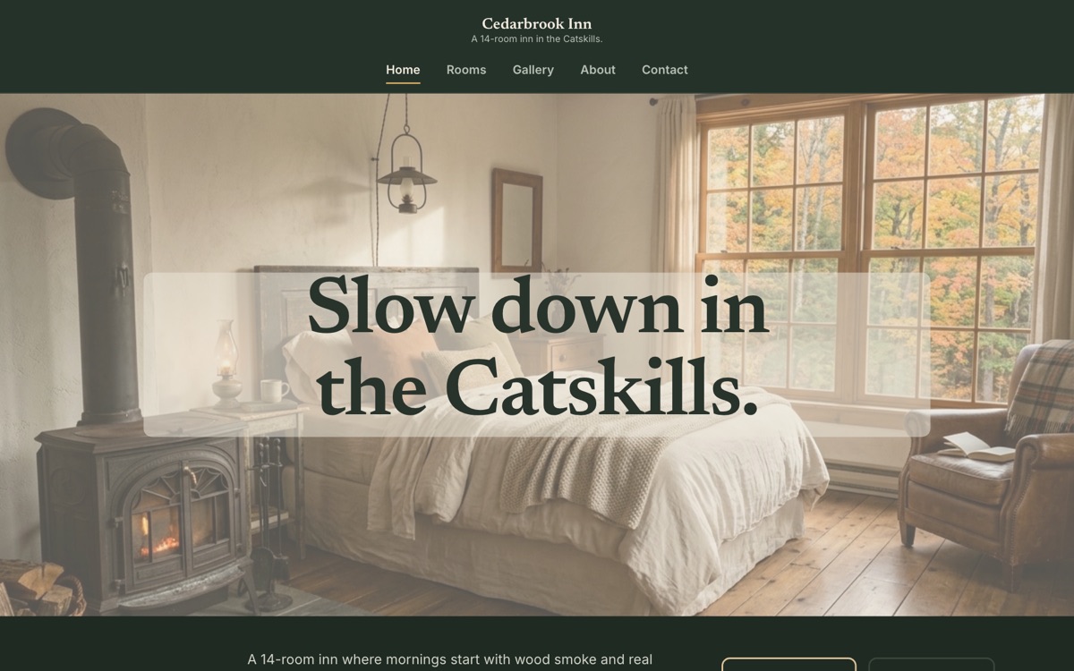
- The same brief in a different industry, or the same industry with a different personality, comes out looking like a different studio built it. Compare Harlowe & Finch with the other real estate build below to see exactly that.
What a real estate site has to get right
Compass templates everyone has
You and forty other agents in your market run the same three layouts. When a seller is choosing who to trust with their biggest sale, looking like everyone else is how you lose the listing.
Reviews buried three clicks deep
Your best testimonials are stuck on Zillow. A seller deciding between you and the next agent should see them the moment they land, not after three clicks.
Curious how your current site handles these? Run the free real estate site audit. It checks the exact things above, in about a minute.
Keep exploring the collection
All eighteen builds →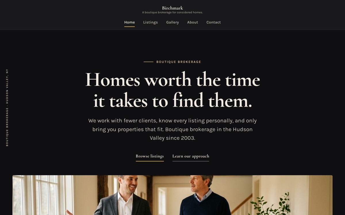
Yours would be board nineteen.
Same process, your real business: designed, written, and live for one flat monthly price. No project fees.
Not sure which direction fits you? Try the style playground.